


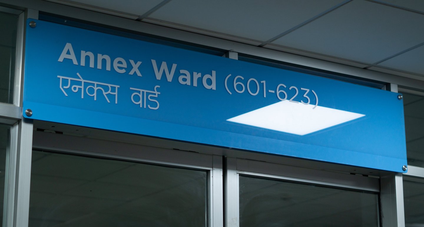
Bespoke type design for Manmohan's directional and wayfinding signages.
Manmohan CVTC
Font Design, Signage
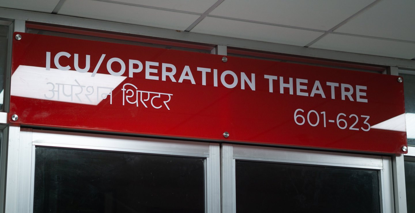
Aesthetic Studio required a Nepali devanagari font that was light in weight and complemented bold Latin alphabets, especially one that seamlessly incorporated ligatures. Given the scarcity of thin fonts in Nepal and the limited support for ligatures in available fonts, the Ugratara typeface emerged as the perfect choice.


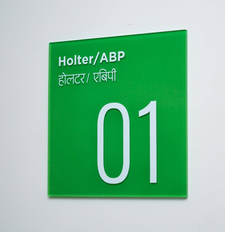


This case study primarily delves into the output and results of the wayfinding and directional signage system after its installation at Manmohan CVTC. Aesthetic Studio utilized the Ugratara typeface in their design, and I extend my gratitude to them for graciously sharing these aesthetically pleasing shots. The signage installation was expertly carried out by Red Carvers, and due credit for the photographs goes to them.
Manmohan Cardiothoracic Vascular and Transplant Centre (MCVTC), established in 2009 under the T.U. Institute of Medicine (IOM), is recognized as a center of excellence in the fields of Cardiac, Thoracic, and Vascular treatment. It is committed to providing the highest quality specialized care for patients with Cardiac, Thoracic, and Vascular diseases.
When Manmohan CVTC approached Aesthetic Studio & Red Carvers for their directional signage and wayfinding solutions, Suden Shrestha, the creative director of Aesthetic Design Studio, reached out to me to inquire about fonts suitable for the signage system. Specifically, he was looking for a font that was thin, modern, and harmonized well with bold Latin alphabets. At that time, I was in the process of designing the Ugratara typeface. Upon showcasing it to him, he not only loved it immensely but also agreed to use it, marking the first commission of my font.
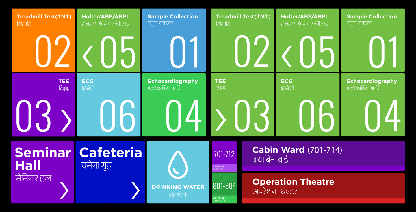


Commissioned project in collaboration with Aesthetic Design Studio & Red Carvers Signage.


Ugratara Typeface is available for purchase upon request, Kindly Contact.
© The Graphic Ant 2024
hello@thegraphiant.xyz

Independent Type & Graphic Design Freelancer Specializing In Type + Identity + Motion.
