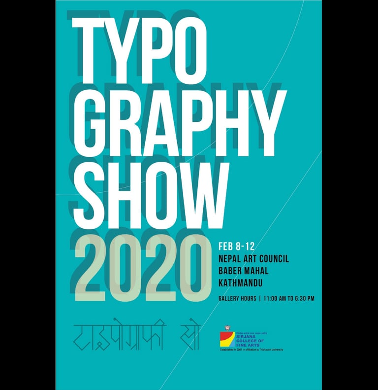
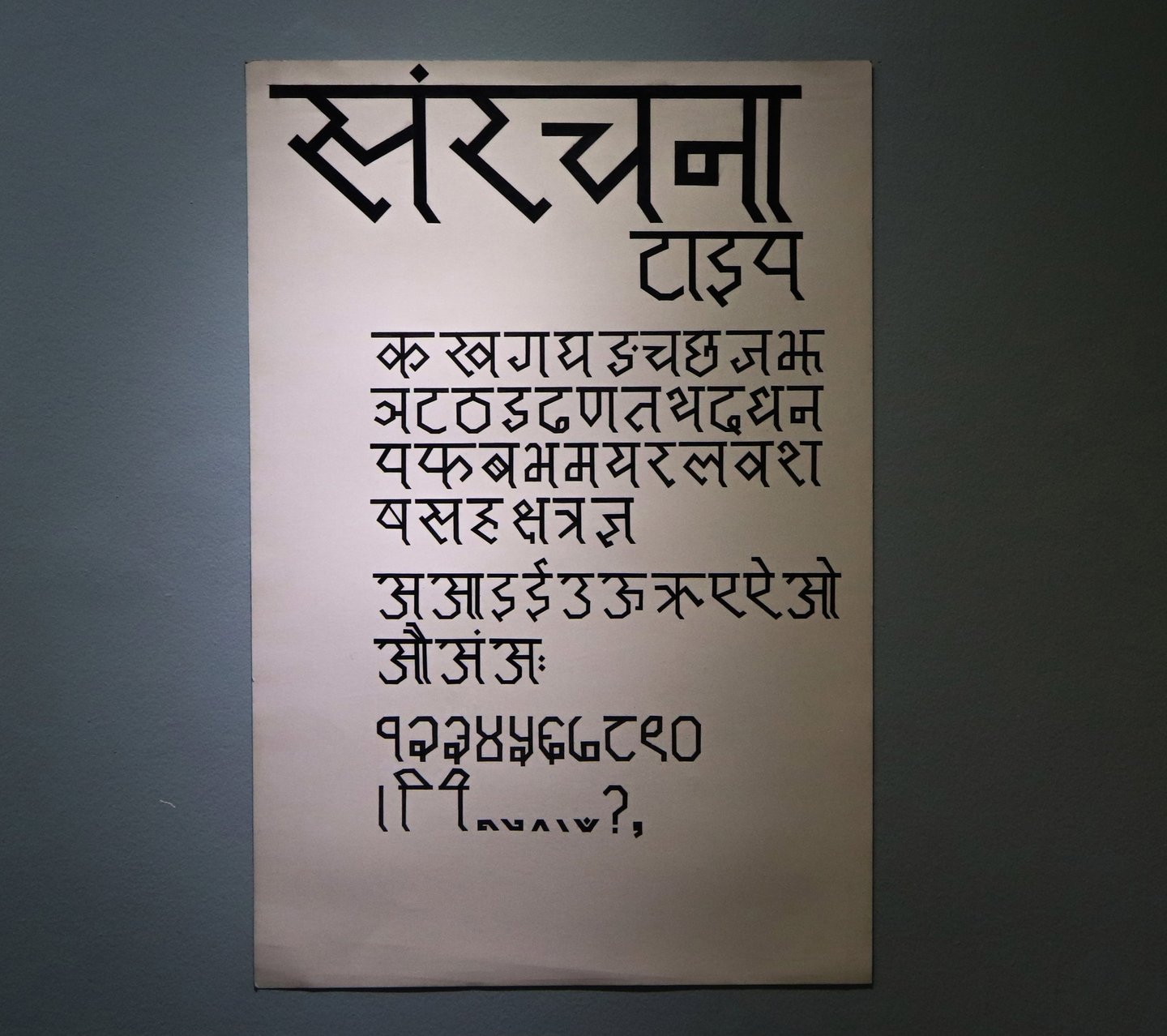
Type design exhibition with college friends at the Nepal Art Council.
Typography Show 2020
Font Design, Exhibition
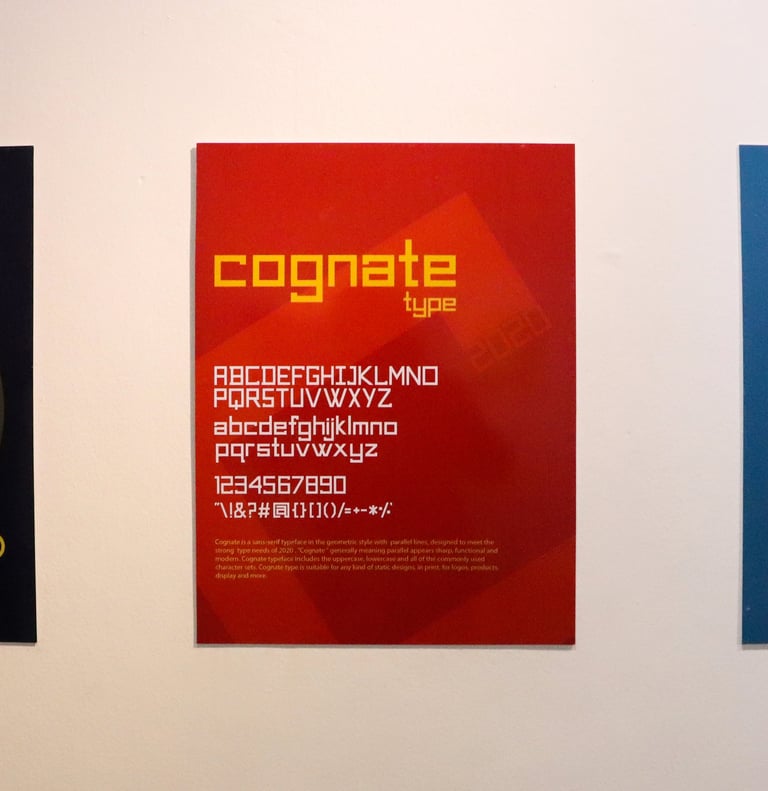
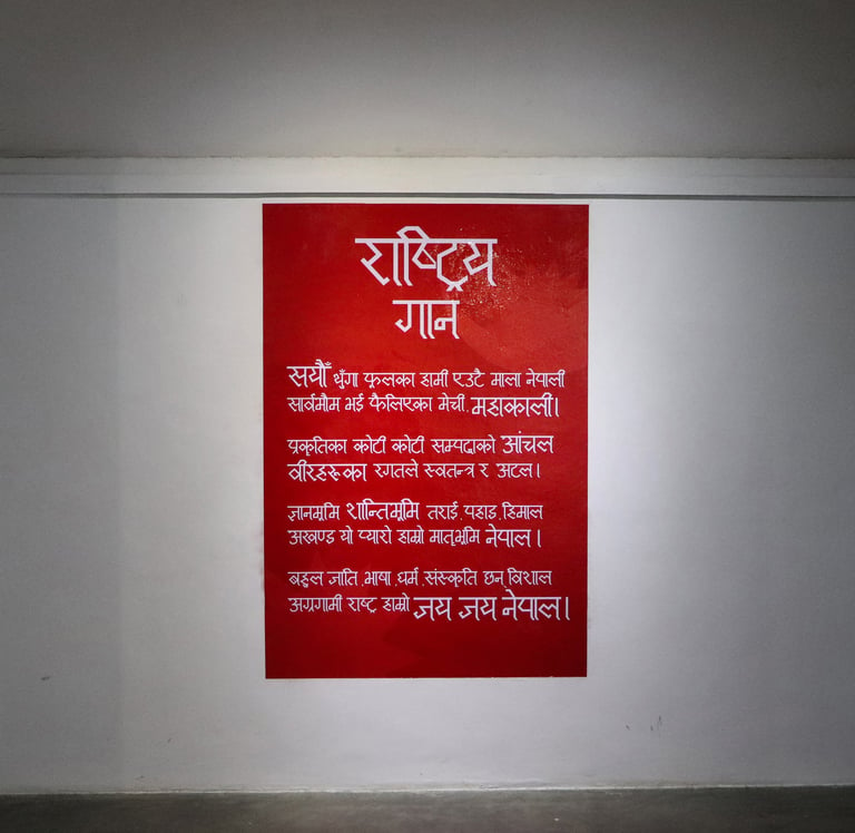
After manually drawing and finalizing the construction, the font was digitally developed. "Cognate Type" is displayed on the exhibition wall, following digitization and forex printing, showcasing its meticulous construction and consistent width.
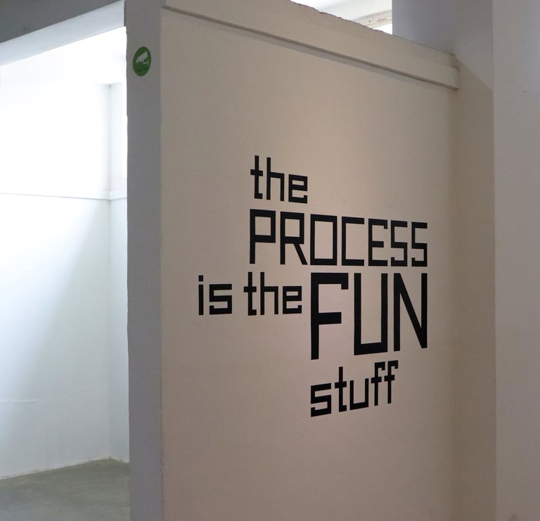
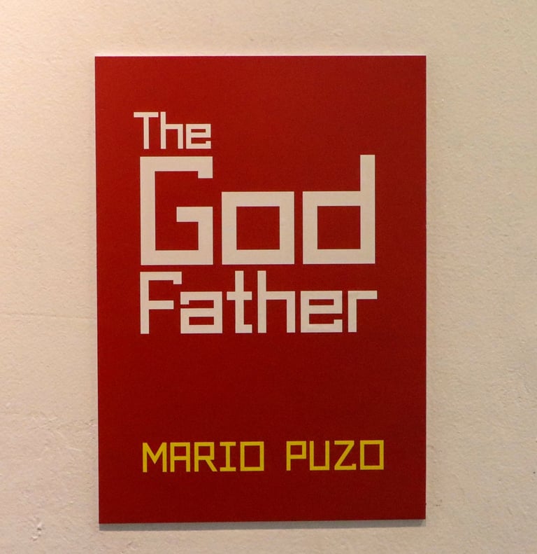
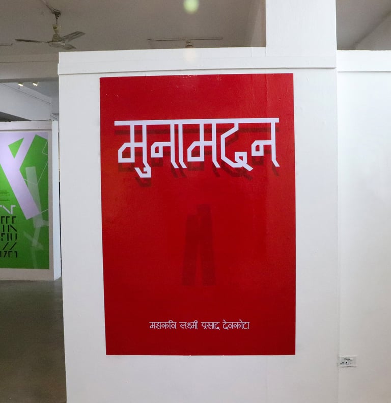
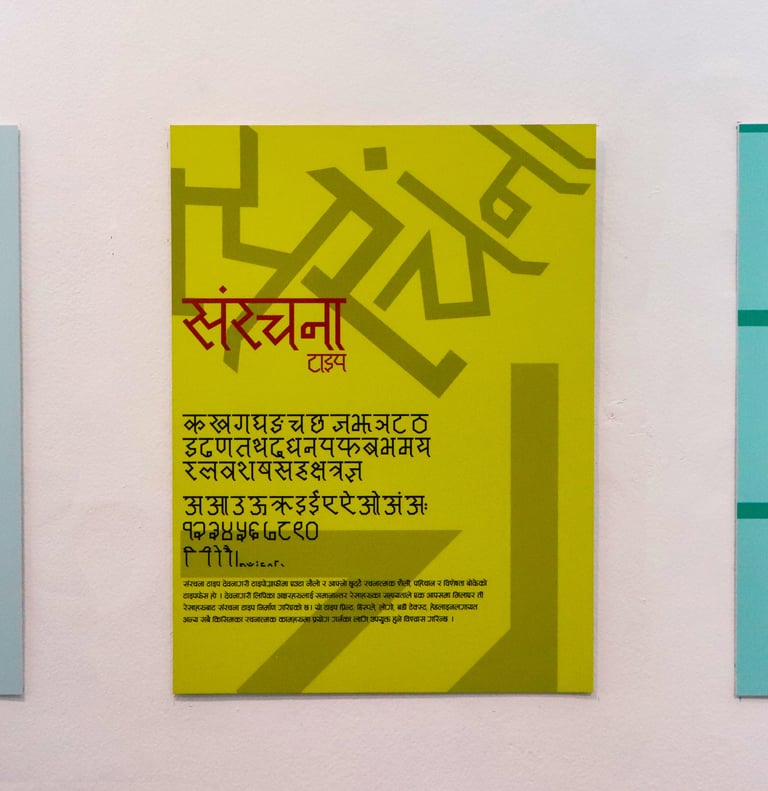


A video showcasing the manualization of type on A1-sized paper with a pencil before inking it with 1-point brushes and digitization. The process was challenging, requiring precise construction and geometry by hand directly on paper and coloring it without any mistakes, following the grid on the topboard paper. To simplify, a custom 2-inch scale was designed to ease the process, measuring the type and construct letters manually. A small error could ruin the design, necessitating a restart on another sheet. Later, following the same scale and geometric construction, the type was also digitized.
This case study exclusively showcases only my works in the exhibition organized during my second year in the BFA Graphic Communication program at Sirjana College of Fine Arts. Together with my cherished 12 friends, we dedicated three months of tireless work to the exhibition, and the collective efforts resulted in the inclusion of everyone's work in the group exhibition.
The conception and triumph of the exhibition are credited to Mr. Bijaya Maharjan Sir and Sirjana College Of Fine Arts. Prior to this, there had never been a typography exhibition, and this marks the second occasion our college has invested significant efforts in typography awareness and the design of custom fonts in Nepal. Mr. Bijaya Maharjan Sir, the Head of the Department of Graphic Communications, played a pivotal role in the exhibition's success through his remarkable patience and creative direction.
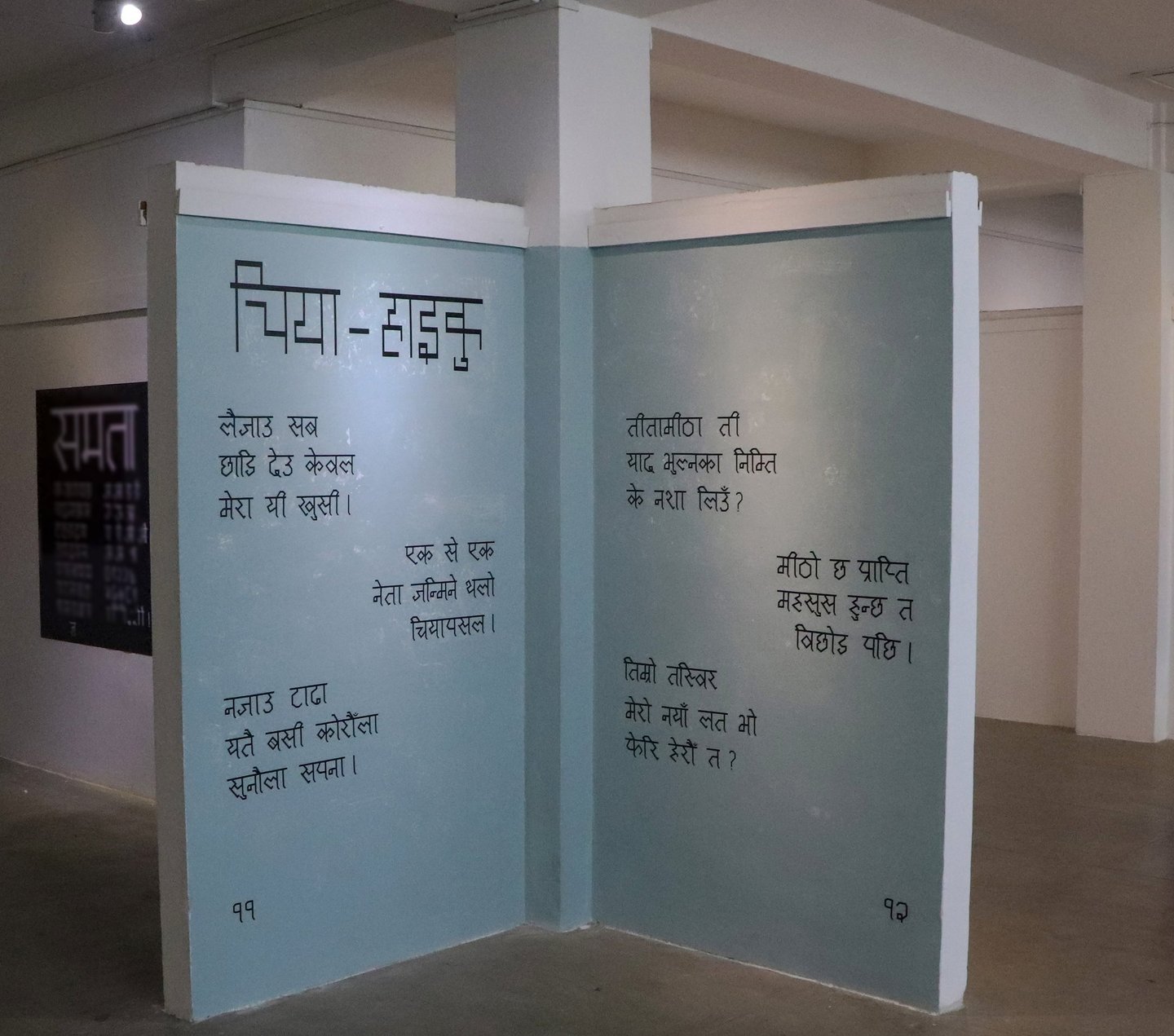
Typography Show 2020, a second-year BFA Graphic Communications exhibition by students from Sirjana College of Fine Arts, including my beloved 12 friends and me. Held at the Nepal Art Council, this marks our college's second edition, spotlighting the importance of 'Typography' as a subject. Beginning with rough form sketches, progressing to constructing letters manually on A1-size paper, and eventually digitizing for posters, this exhibition significantly boosted my passion in typography. I designed Devanagari and Latin typeface and used them on some famous books covers and posters. The exhibition adeptly accomplishes dual objectives, showcasing innovative type fonts and unveiling new print designs exclusively based on these fonts, minimizing the use of other visual elements. It's a distinctive fusion of creativity and skill, offering a novel perspective on design.


Personally, I initially lacked confidence in the exhibition, mainly due to my limited knowledge of typography. However, with Bijaya Sir's assistance, I found the encouragement to push my limits, resulting in the creation of the Samrachana & Cognate font. His creative direction and unwavering belief in my capabilities were instrumental. The majority of artworks showcased during the event incorporated my fonts, marking the beginning of my typography journey.
It would be unfair for me to claim that my teacher gave me more priority, as he equally emphasized the importance of everyone's contributions. Each participant produced outstanding work, sometimes surpassing my own. Nevertheless, I am personally grateful to Bijaya Sir for his trust, guidance, and the significant role he played in my creative development.
A exhibition project done while studying at Sirjana College Of Fine Arts.
© The Graphic Ant 2024
hello@thegraphiant.xyz

Independent Type & Graphic Design Freelancer Specializing In Type + Identity + Motion.