

Identity and strategy for the Country's first food reality show Chef Nepal's mart SMART.
SMART
Brand Identity, Strategy
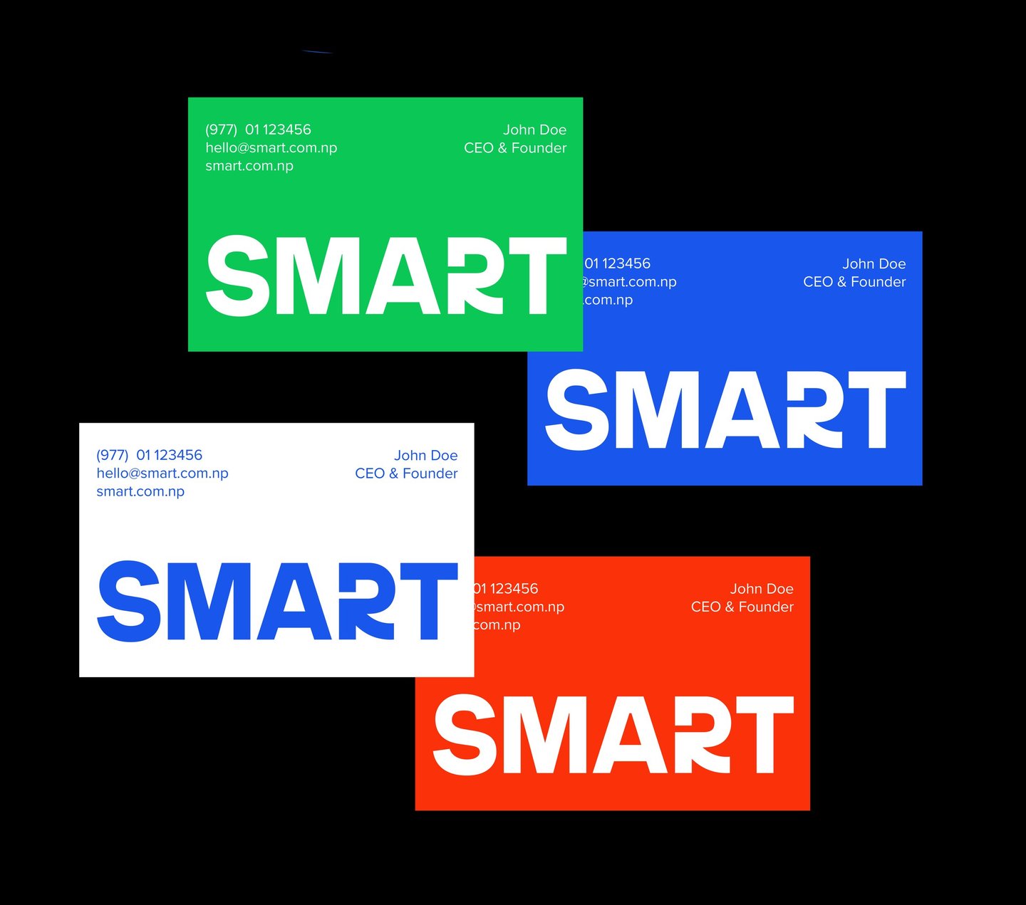

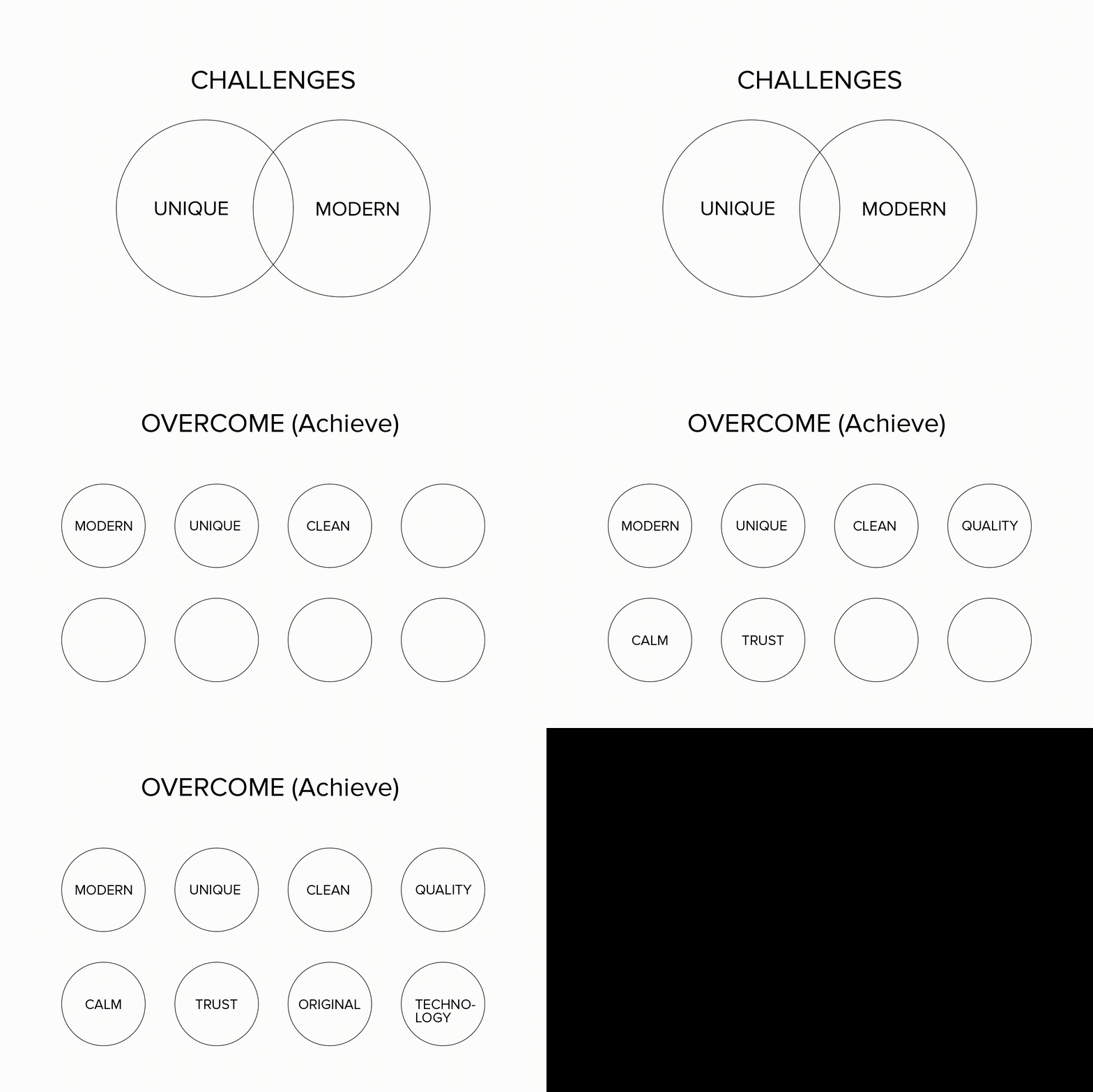
Once challenges and the mission were clearly defined, a custom-made wordmark was intricately designed.


While exploring design options, we initially considered incorporating various symbols. However, it became evident that symbols might not efficiently convey the brand's message and align with its story. Thus, we embarked on a quest to find diverse ways to communicate the essence of sMart.
The initial concept of sMART aimed to encapsulate both the significance of the brand name and the value associated with the term "sMART." The strategic placement of an arrow in the letter R serves a dual purpose—guiding customers toward the mart and symbolizing the concept of returning to oneself. The letter R itself is designed as an arrow/directional symbol, enhancing the logo's visual appeal and ensuring it is both impactful and memorable for your customers. Our design choices were carefully considered to make the logo visually appealing, direct, and memorable, aligning the mart's vision and story seamlessly with its logo.


Chef Nepal is the country’s first competitive cooking reality TV show, dedicated to celebrating Nepal’s rich culinary heritage and shining a spotlight on the talented culinary enthusiasts and individuals working behind the scenes in kitchens. Chef Nepal reached out to me for the brand identity of the show's mart S Mart. Introducing sMart—an innovative grocery mart, delicatessen, and departmental store brand designed to stand out in a league of its own.
At S Mart, we prioritize local products, seamlessly blending tradition with cutting-edge technology. Following an in-depth briefing and extensive research, we meticulously crafted a wordmark for SMART, aligning seamlessly with Chef Nepal's vision and the brand's narrative. The wordmark prioritizes readability and legibility, ensuring visibility on signage, in stores, and on delivery vehicles.
However, this case study is limited due to the budget constraints and specific requirements of SMART. The show later proceeded to create the SMART signage within a confined space. TGA approached Chef Nepal to further develop the brand identity, showcasing practical use cases of the brand elements and logo. Despite the numerous visualizations and extensive research, this case study will have a Version 2.0 to include additional insights and developments.
© The Graphic Ant 2024
hello@thegraphiant.xyz

Independent Type & Graphic Design Freelancer Specializing In Type + Identity + Motion.